Rihanna (artist) – Website

I created my website by using weebly.com I chose this platform because of its extremly user friendly interface. Although it didn’t give me that much freedom in organizing the pages, I managed to create a simple, minimalist website, just enough in order for it to correlate to my other two task – the digipak and the music video.

For designing my website, I used photos from Tumblr.com and her actual website, rihannanow.com. I kept the same colour palette as for the other two tasks. I added the colour cyan on the front page and on the about page as this colour fits with a a series of photos she has and also with the dark themed background.  On the homepage, the header has the artist’s name on and a link to the music page when the “out now” text is clicked. Scrolling down the page, the latest music video (“Higher”) follows. On the bottom of the page, all social networking sites on which Rihanna is connected to are present. As I have said before, it isn’t a very complex website, because people are now following the artist on social media and get their information faster and easier than entering the website on a regular basis for the latest news. This is the reason I only added the most necessary pages, so that people have their information gather on this one website, rather than searching everywhere for it. This includes the following pages: About (biography), Music (discography), Tour (dates and photos) and Store (a re-direct link accessing her real brand store). Because Rihanna herself is collaborating with Puma, I added an extra Fashion page where people can find about her latest work and a gallery from her latest fashion show, all containing links to the real Puma store.

To access the website please click the following link: http://rihanna-now.weebly.com/ 

“Anti” – Digipak

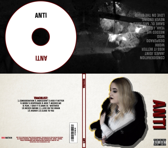
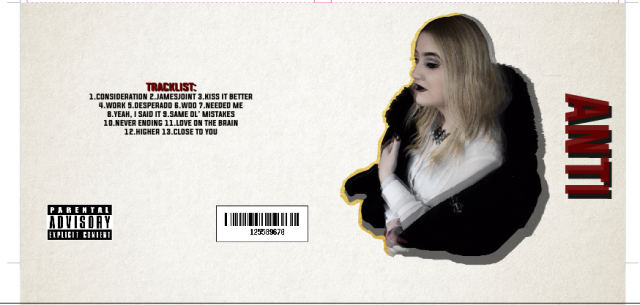
For my digipak, I used Adobe Illustrator. My idea was having a bold visual piece. I have managed to do this by contrasting colours – black and white, and adding the red. The black and white is used to visually describe the mixed feelings she is going through. Red is the colour the word “anti” transmits. Because I didn’t want my digipak to be too loaded I decided to stick with one bold visual piece on the front cover – the face people see first. The double layered picture is made from two layers, one coloured, one black and white (with opacity at 70%). The layers are shifted to create the blurry feeling and make people look twice in order to understand what is going on. The purpose of the golden textured shape is to illustrate the shift between the layers. Because this one thing was enough to attract the audience, I kept the rest classic with the track list, bar codes and credits on the back cover and a simple design of the CD on the inside. I also added the track list on the inside for functionality purposes – easier to access the track list and then, select the desired song. I used the shot illustrating the fireplace taken from the music video, again, too show these mixed feelings of the character. The bold font is used to express this strong connotation of the word “Anti”.

ANTI GUD-01

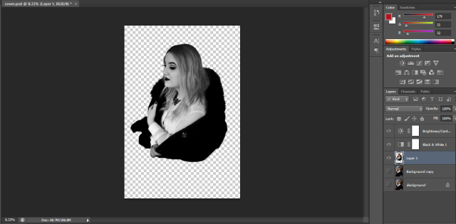
Here are some screenshots of the process:

For the font I used dafont.com and in the end, settled with “Evogoria”, because I founded it to be the most appropiate.  I also wanted to create a different background in Photoshop, but, as I’ve said before, because I already have the bold visual piece on the cover, I decided to use a simple white coloured background.

Digipak – Photo selection

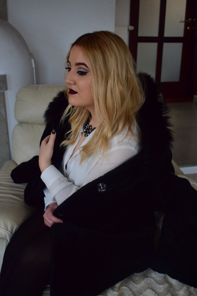
I took more pictures after filming the music video from which I have made a selection and then chose the final photo. First, I corrected the colours in Adobe Lightroom. Then, for further editing, I used Photoshop. Here is my selection:

My final decision was based on the feeling of strength and power the picture could send. This is why I went with this photo: DSC_7130

“Higher” – Music video


General idea: The video shows an independent woman – which is visible from her aspect (clothes, make-up, accessories) who has experienced a recent heartbreak, but she is still standing strong, managing to keep it together with a little alcohol and some cigarettes through the night.

Technical aspects: My music video is very classic. There isn’t much technical challenge because I wanted to keep it clean. As i chose to do an illustrative music video, I wanted the audience to focus on the lyrics of the song. This is the reason why the shots and the entire montage aren’t something complex. The colour choice is black and white because it expresses the phase she is going through right after the break-up. Also, the grayish tints tend to change to show the passage of time (different hours – different lighting). The video is mostly based on close-ups and blurs to omit the male gaze and in order to establish an emotional connection with the audience and engage them into the music video and the song. In order to set the atmosphere I added in the beginning and also at the end a fireplace sound. I used the “barn door” transition to stick with the classical style. The red colour of the credits is representative for the name of the album and even Rihanna herself. The font used for the title of the song is italic because it fits this “vintage” theme. Meanwhile, the artist’s name is bold; representative for her personality.

FIRST DRAFT:

FINAL WORK:

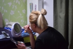
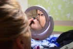
Here are some photos taken from before and during filming: